Sustainable Design
Focusing on integrating sustainability into my designs, I created a hypothetical sustainable business in which I developed bus shelter posters using only words and no images that portrayed a message to consumers, developed Instagram stories using AI that demonstrated the business goal, and used Figma to design infographic poster and prototype a mobile website for the company.
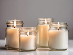
I first developed my hypothetical business. I chose to make a candle company. My candle company, Cycle Candle Co. is a company that has a jar exchange program in an effort to be sustainable. The company sells soy-burning candles and believes that you should be able to enjoy something new to refresh your life, like a candle, frequently without having to consistently produce waste. Once purchased and burned, the empty candle jar can be returned for a discount on a new candle. These jars will be cleaned and reused to make new candles.

Next, I used AI to create images and Instagram stories to develop a mood board for my company and begin drafting ideas. These images would be used as I help develop the company and develop various iterations of my original company idea. These could also be used for the final part of the project, developing a mobile website. The hope was that these images could be displayed on the website.

At this point I finalized and updated the company outline and made clear business goals:
Cycle Candle Co. is a company that has a jar exchange program in an effort to be sustainable. The company sells soy-burning candles and believes that you should be able to enjoy something new to refresh your life, like a candle, frequently without having to consistently produce waste. Once purchased and burned, the empty candle jar can be returned for a discount on a new candle. These jars will be cleaned and reused to make new candles. The company has just launched and has the campaign goal of spreading the word/ increasing brand awareness and gaining more customers. Each package/ purchase comes with prelabeled materials to ship back the empty candle jar, once the jar is received a custom discount code is emailed and texted to the customer for their next purchase. The company's goal is to help promote the recycling of glass.
The company’s target audience is American women between 20-60 years of age, who live near the ocean. Specifically, New England coastally located females. These women largely are attempting to be or identify as sustainable consumers. They try to/are trying to make environmentally conscious choices, so this candle is perfect for them. For my campaign strategy, this bus shelter poster will be put up in various coastal communities on the coast of New England, including both Newburyport and Rockport, Massachusetts, in order to specifically catch the attention of the target market.
bus shelter posters using only words and no images
these posters had the goal of demonstrating what the company was and how it was sustainable as well as pushing the person viewing the poster to complete an action, in this case, sustainably purchase a candle

Iteration 1

Iteration 2

Final Design
My design of this bus shelter poster illustrates at first glance how Cycle Candle Co. sells candles, and there is a way to get a discount on these candles. The intent is that while walking past the poster, the design of the candle shape will catch the eye of the individual passing. Upon examining the image further, the individual will realize the candle shape is made from one line repeated in various sizes, ‘return empty candle jar for a discount.’ For my poster, I used one font for almost everything, Lancelot. This font is clean, and easy to read from afar. Also, after researching other similar businesses, especially costal businesses, I have noticed a font trend. Minimalist, simple, clean fonts are common and aesthetic within these costal businesses. I wanted to recreate this feel for my candle company, especially because we are encouraging being a clean consumer. In addition, I intentionally changed the font and bolded only one word on the poster, ‘earn’. This is to draw attention to this, demonstrating that there is a way to earn something, which in this case is a discount. A lot of people typically seek to gain something; they want to be rewarded. The hope is that by emphasizing the word ‘earn,’ I can attract the individuals whose attention is drawn to the concept of earning and/or receiving something. This word earn is also intentionally aligned to the part of the candle shape that has the largest font sized line within the shape at font size 159. This is to draw the attention that way after reading the main words ‘burn, return, & earn.’ For my color choice, I again wanted to play on the costal asthetic. I chose a deep blue that resembles a deep ocean color. Blue is also considered a calming and relaxing color. I want the idea of burning a candle from Cycle Candle Co. With these same feelings of calm and relaxation. I kept the font a white color for readability. The white on the dark almost navy blue will be a good contrast for people passing the poster from all distances.

Iteration 1
Iteration 2

infographic poster
designing with numbers
On this infographic part of the project, I found real statistics from various sources. I went through the data and developed charts and infographics to create a poster. I had the limitations that I had to include at least three visual different types of charts on the poster and had to include at least five types of data. I went through thirteen iterations before coming to my final design for this part of the project.

Iteration 3

Iteration 4

Iteration 5

Iteration 6

Iteration 7

Iteration 8

Iteration 9

Iteration 10

Iteration 11

Iteration 12
My goal was to demonstrate how glass waste is a very big problem in the United States. I wanted to illustrate just how much glass waste we accumulate, and how much of it is actually recycled, and I wanted to show what happens to what isn’t recycled. By including certain statistics I was able to do so.
.png)
Final Design
I structured my information from top to bottom. The information can all be standalone and would still make sense, however, when read from top to bottom the information builds upon itself. Starting with the amount of glass waste collected, then breaking that amount down and showing what happens to the portions of that. I next show the recycling trend line, which shows that this number hasn’t evolved much from 1980-2005. This trendline also shows that growth in glass recycling has slowed. To reinforce this I then show a progress bar showing only 31%. I added a few words with this to explain that the 31% is the United States glass recycling percentage. I chose to use the progress bar because it not only illustrates the percent completed, but the non-highlighted part shows just how much more recycling of glass needs to be done in comparison. Finally, I added a data point in the bottom right and highlighted the year amount to show what a large number this is. I chose to add the data of other items like plastic and tin to provide a comparison to help people understand how impactful this is because I think most people tend to think plastic is more of a problem. I chose to keep my blue color scheme because my target audience is people from the coast and my brand narrative is a coastal, sustainable, relaxing, calming, candle company. I feel that the blue color scheme portrays these emotions and appeals to this target market. I also used the same simple font for all text to keep a minimalist feel. I intentionally change the colors of certain words and numbers as well as enlarged them to make sure the most important information jumps out of the page. Lastly, to tie my design together I added a simple sentence at the bottom which calls the poster viewers to action. “Shop sustainable and reduce candle glassware waste.” This line reinforced the ideas of my poster, that glass waste is a serious problem we need to be conscious of and work to reduce and it turns the viewers of my infographic poster into potential customers. The poster makes people want to make more conscious consumer choices, especially when buying candles with such wasteful glass. They will be more likely to purchase from Cycle Candle Co now to help with this problem.
prototyped mobile website
my final part of this sustainable design work was to create a prototyped website for the hypothetical candle company that I created that incorporated my previous work including the ai generated images, the infographics, and the bus shelter posters
Cycle Candle Co., had the original campaign goal of spreading the word about what the business was, as it was hypothetically a newly launched business. The goal was to increase brand awareness, consumers, and followers. As I pursued the project, the goal of educating people about glass waste and promoting sustainable consumerism was added to this list. These goals work together. As the company promotes sustainable consumerism and recycling, it offers consumers sustainable products and recycling procedures for those products while also rewarding the consumers for shopping sustainably. As I developed my final prototyped website design, I incorporated things from previous parts of the project to contribute to my campaign goals. I feature a glass waste statistic section on my About Us page. This was intentionally listed after the mission statement in order to contribute to the mission statement's ideas. The mission statement discusses things like excessive waste, recycling, and sustainable consumerism. Listing facts to support why one should consider being sustainable and purchasing from sustainable companies helps enforce these ideas, especially because of how product-specific the glass statistics tie into our company's glass jar recycling program. This had the goal of getting customers thinking about the impact they are making with their purchases, pushing them to purchase from Cycle Candle Co. I wanted to make sure to include how the recycling program worked. I had received suggestions to do a pre-paid return label and packaging for it. I loved this idea. On my About Page, I included a large section for this. When I got feedback on my business this had been something people were wondering, so I figured if this was coming up now this would definitely be a commonly asked question for customers. Further, I wanted to break up the text on that portion to make it a bit more readable and nicer to look at. To do this, I included bubbles that have the steps shortened down and written in them. This also backs up what the text is saying, simplifies it, and ensures people understand how the process works to return a jar and get a discount. I also played around with different color contrasts for readability and adjusted some of my graphs. I decided to keep the background the same color throughout my pages and site for a sleek look. I did not like adding different color blocks to the site. I found it seemed to break up my content too much. I used an information hierarchy system to structure the text on my page. The company logo header is the largest, then the page header, followed by the rest of the page body information in size 16 font. This helps structure the information and allows people to quickly browse the page to see if what they are looking for is on that page or if they should jump to another. For my prototyping, I made my header scroll with the page so that people can easily navigate at any point. By selecting the brand name on the top left you will be redirected to the home page. This is something I often see on websites and a feature I like when I get lost on sites and need to find my way back to the home page. I incorporated this feature for that reason. Next, I made my navigation page close out to whatever page the user was previously on, as demonstrated during class. I liked this feature a lot and wanted to incorporate that in my prototyping. On my navigation page, there are a few things listed that the pages are not yet made for. However, if the site was fully completed these are pages I would want to have. A Contact Us page would be useful, as well as a page for your shopping cart. I have a shopping cart in the top right header menu. This would ideally also be clickable and bring you to your cart page. Further, I have a products section listed in my navigation. This currently links back to the home page because I have products listed on the home page. However, this would ideally have its own page for product shopping only. This would be separate from the home page. For my prototyping, everything that I could prototype given the pages I had created was prototyped.